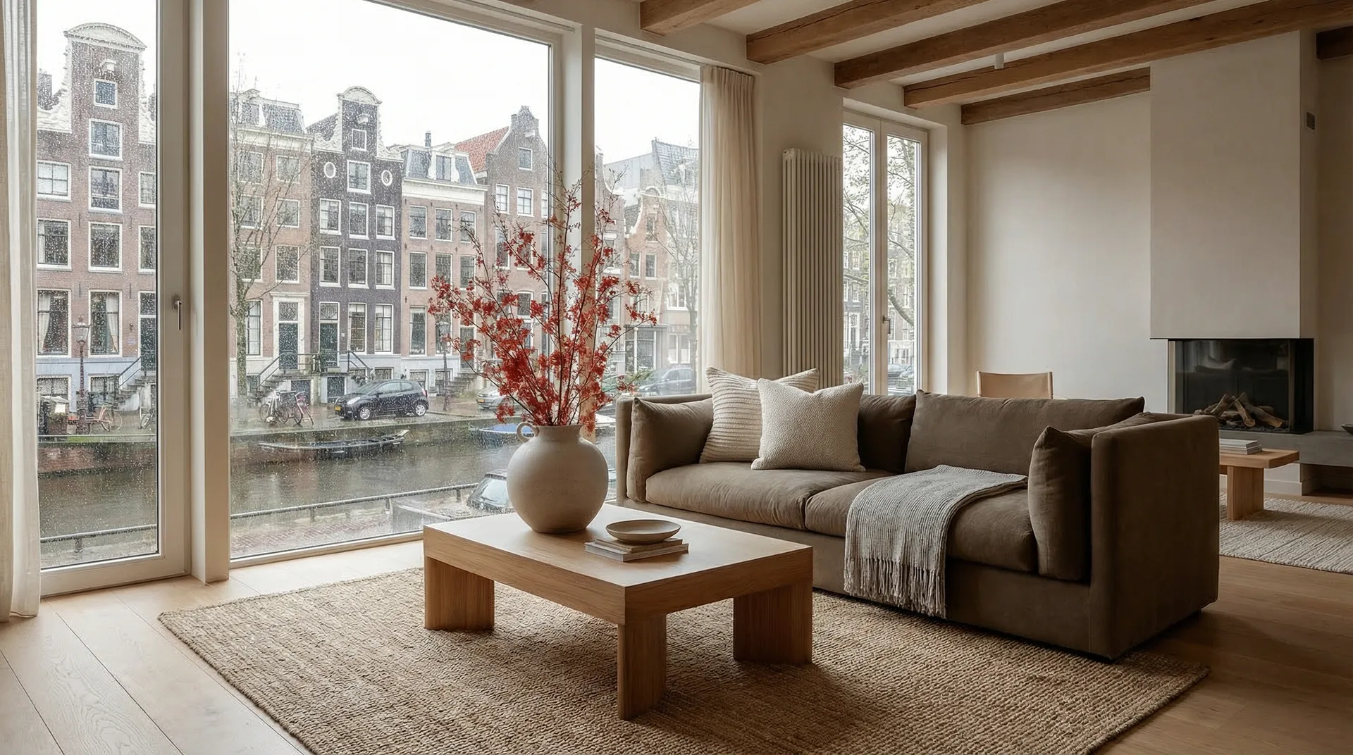
There is a specific quality to the light in a Dutch home. It is often described as “milky” or “diffused,” washing over stark white walls and hitting the floorboards at a sharp angle. If you sit in a café in Amsterdam or visit a renovated townhouse in Haarlem, you might feel a strange sense of déjà vu. You haven’t been here before, but you have seen this room.
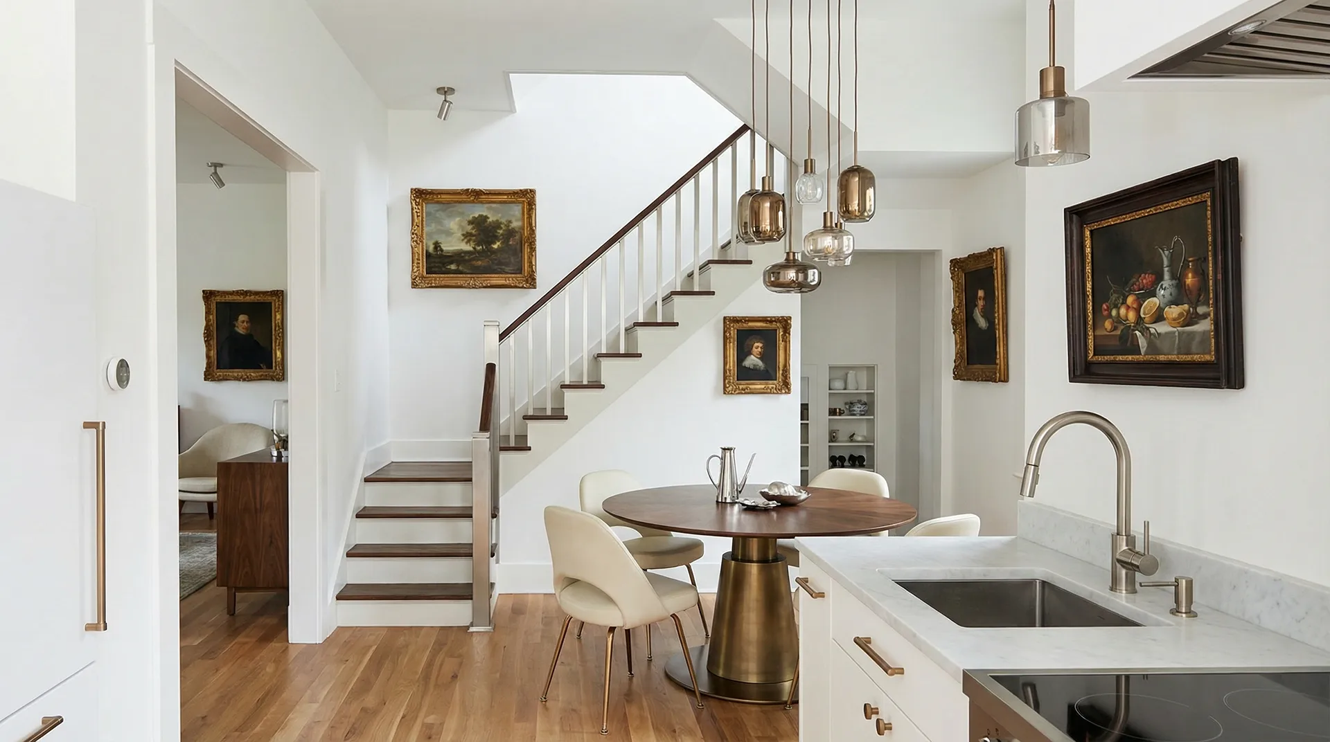
You have seen it in the quiet domesticity of a Vermeer painting. You have seen the geometry in a Mondrian grid.
The relationship between Dutch art and the spaces we live in is profound. It isn’t simply a matter of hanging a print on the wall. The very DNA of interior design in the Netherlands—and increasingly, globally—is entangled with the country’s artistic history. From the Golden Age to the radical modernists, art has dictated the aesthetics of how we build and how we dwell.
The Tyranny of Light
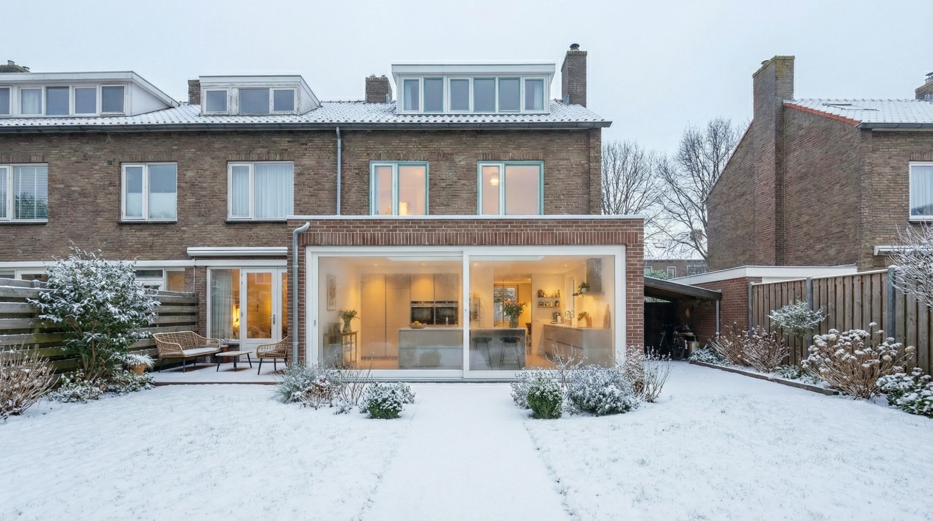
To understand Dutch design, you have to talk about the windows. In the 17th century, artists like Johannes Vermeer and Pieter de Hooch didn’t just paint people; they painted light entering a room. They were obsessed with how daylight transformed a domestic space, creating pockets of intimacy and clarity.
This obsession hasn’t faded; it has just moved from canvas to construction.
In modern renovations, the influence of this “Golden Age” distinctness is visible in the prioritization of natural light. We see this in the trend for massive steel-framed glazing and skylights that wash a kitchen in brightness. It is not just about seeing outside; it is about bringing the outside atmosphere in.
When architects and builders discuss “sightlines” today, they are essentially conducting a composition exercise similar to the Old Masters. They are asking: purely from a visual standpoint, how does the light hit this corner? Does it create a sense of calm?
The Radical Grid: De Stijl and Minimalism
If the 17th century gave us mood and light, the 20th century gave us order. You cannot walk through a modern, open-plan apartment without owing a debt to the De Stijl movement.
Artists like Piet Mondrian and architects like Gerrit Rietveld stripped art down to its bare essentials: horizontal and vertical lines, and primary colors. They believed that art shouldn’t be separated from life—it should be life.
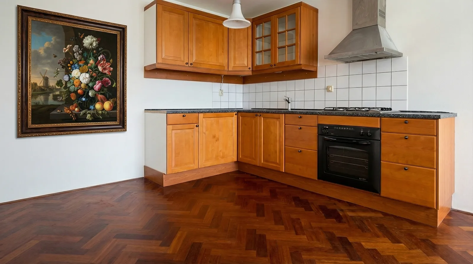
This philosophy is the grandfather of modern minimalism. The current trends favoring built-in cabinetry, hidden storage, and flexible partitions are direct descendants of Rietveld’s sliding walls. It is the idea that a house should be a machine for living in, but a beautiful one.
We see this manifested in the sharp, clean lines of modern kitchen extensions and the functional use of space in compact urban homes. It is an aesthetic of “less is more,” but with a distinctively Dutch pragmatic twist: it has to work, and it has to last.
The “Rembrandt” Palette: Moody and Textured
However, there is a counter-movement happening. While white, minimalist spaces have dominated for years, we are seeing a return to the shadows—a trend often dubbed “modern chiaroscuro.”
Inspired by the dark, dramatic backgrounds of Rembrandt’s portraits, interior designers are embracing deep blues, charcoal greys, and forest greens. But it isn’t just about paint color; it is about texture.
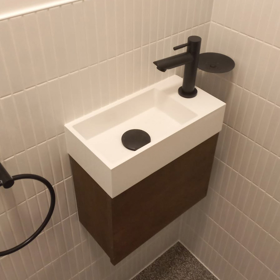
Dutch art has always celebrated the tactile—the sheen of satin, the roughness of worn wood, the peel of a lemon. Translating this to renovation means we are seeing a move away from sleek, sterile surfaces toward materials with character. Think exposed brick walls, polished concrete floors that show their aggregate, and walnut joinery.
Achieving this balance between the raw and the refined is a construction challenge. It requires a contractor who understands that a wall doesn’t always need to be perfectly smooth to be perfect. This is where expertise matters. Firms like Luckey Construction understand that capturing this aesthetic isn’t just about decoration; it’s about the structural preparation and the quality of the finish that allows these textures to sing.
Contemporary Dutch Design: Honest and Sustainable
Moving into the 21st century, the influence shifts to the likes of the Droog design collective. This is design with a sense of humor and a conscience. It champions “honest” materials—what you see is what you get.
This has influenced a massive shift in construction toward sustainability and visible mechanics. We are seeing trends where:
- Piping is left exposed rather than boxed in, turning utility into art.
- Recycled materials are celebrated (e.g., kitchen counters made from recycled plastic).
- Structural elements like support beams are highlighted with bold colors rather than hidden.
It is an unpretentious approach. It says: “This is a house. It has pipes and wires and beams. Let’s look at them.”
The Psychology of Space
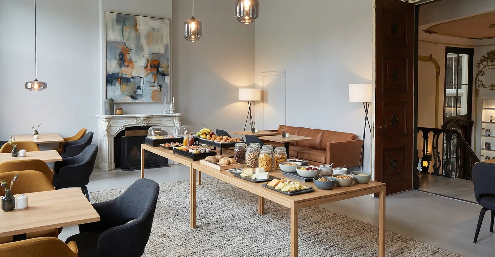
Ultimately, what connects the 1600s to the 2020s is the Dutch concept of Gezelligheid. It is a word that defies direct translation but encompasses coziness, belonging, and time spent with others.
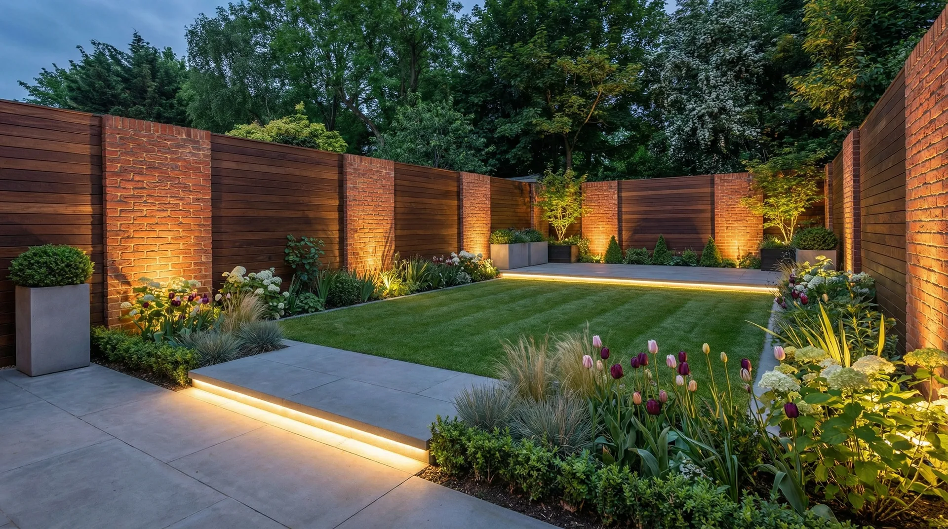
Art historians argue that Dutch genre painting was invented to celebrate this feeling. Today, interior design aims to manufacture it. The open kitchens, the connection to the garden, the warm lighting schemes—they are all physical manifestations of a cultural desire for connection.
A room is never just a box of bricks. It is a backdrop for life. Whether you are leaning toward the severe lines of Mondrian or the warm embrace of Vermeer, the goal remains the same: to create a space that feels human.
Summary
The bridge between the art museum and the construction site is shorter than we think. When we plan a renovation, we are rarely starting with a blank slate; we are building on centuries of visual culture. The Dutch tradition teaches us that a home should be a masterful manipulation of light, a celebration of texture, and above all, deeply functional. As you look around your own living space, ask yourself: are you living in a white cube, or a composition?